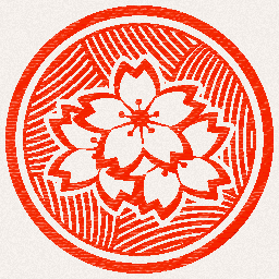
Yup, updated and animated the logos. And already got it up and running in-engine:
It does look like a stamp right? That was the look I was going after.
Why this style though? Why not something more “gamedev-ish”? Explaining the reason would take a lot, so leave it on “because it is what I like”.
Plus not like all logos of this kind should have a controller slapped into them, in fact I don’t like them to have that.
This is but a little heads up over some of the things I’ve been working on.
So thank you for reading the short post, and for reading my blog ;D
